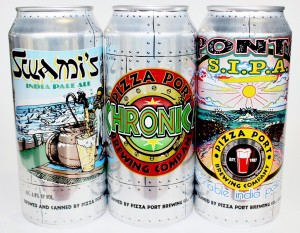
For better or worse, the two companies (which also share two majority partners) have long been confused in the marketplace. Aggravating that confusion is the close history between the brewery founders.
In May of 1997, Port Brewing co-founder Tomme Arthur was hired as the head brewer at Pizza Port in Solana Beach, Calif., a position he would hold until 2005, when he was named the company’s director of brewery operations. In 2006, Arthur and Pizza Port founders Vince and Gina Marsaglia decided to launch Port Brewing and the Lost Abbey in a San Marcos, Calif. brewing facility left vacant by Stone Brewing, which had moved to more spacious confines in Escondido, Calif.
And that’s where the confusion begins. Despite the two companies being separate entities and holding separate brewing licenses, Port Brewing and Pizza Port have something else in common — each brand’s logo consists of a circular porthole and a pint glass. So, to help distinguish the Port Brewing brand on-premise, Arthur and company created tap handles adorned with a single flip-flop.

But it wasn’t until earlier this year, however, that potential off-premise marketplace confusion became an issue. In January, Pizza Port debuted three of its most popular offerings in cans. Two of those cans featured the familiar circular shaped branding and pint glass imagery.
Port Brewing, on the other hand, currently distributes its beers in 22 oz. bottles and on draft, but if Port were to ever launch an aluminum package, consumers might find themselves struggling to differentiate between the two brands.
Combatting the potential for such confusion, Port Brewing yesterday unveiled a new logo and website design that it hopes will help separate the brand from Pizza Port.
“There is definitely some brand confusion,” said Adam Martinez, Port Brewing’s marketing manager. “We do have our own identity, so when we can do little things to add some separation, we try to take that opportunity.”
Port Brewing has moved away from the port hole and pint glass look and focused its branding efforts behind a more recognizable icon on beaches worldwide: the flip-flop.
“We’ve been using the Flip-Flop tap handles to brand our draft beer for the past 7 years,” Arthur, who also serves as the director of brewery operations for Port Brewing, said in a press statement. “Adding these icons to everything from our new website all the way down to our bottle caps makes perfect sense.”

Port Brewing believes the new brand direction, which was designed by Varnish Studios in conjunction with GRID Design + Technology, will help to emphasize the brand as it was originally intended to be: “Laid Back but Hop ForwardÔäó.”
The refreshed look will begin finding its way to bottles and packages in the next few months, Martinez said.
“It is going to be a slow process, because we don’t want to totally lose the look we have,” he said. “We are hoping by this time next year, all of our labels will be redesigned so it is consistent.”
The company has also separated the Port Brewing website from its line of Belgian-inspired and barrel-aged beers, The Lost Abbey.
Beyond the rebrand, the company is also in the process of expanding its barrel-aging program, eyeing potential locations for a secondary brewing facility and finalizing plans to build a tasting room in Encinitas, Calif., Martinez said.
“We are constantly looking at additional locations,” Martinez said of plans to build a new brewery. “We are just trying to find the right spot for us. We are not going to jump into the first place that has a lease available. It is part of the five-year plan and if it happens sooner, great, but we are waiting for the right opportunity.”
More details on the expanded barrel-aging program and the taproom will be made available in the coming weeks, Martinez said.
