Editor’s Note: In the final entry of our three-part series on branding considerations for craft breweries, Isaac Arthur, a partner and designer at CODO Design in Indianapolis, Indiana, explains how an established brewery might approach a rebranding process.
Who is Isaac Arthur? Isaac has worked on branding projects for a number of craft breweries — including Fernson Brewing, 450 North Brewing, and Big Lug Canteen. His company recently published an extensive (and free) craft beer branding guide that covers everything from naming and package design strategies to lessons on navigating the TTB label approval process.
Before you dive into Arthur’s piece, below, make sure you read parts one and two: Branding the Bootstrapped Brewery and Branding the Well-Funded Brewery Startup.
PART III: REBRANDING AN ESTABLISHED BREWERY
In parts one and two of this series, we looked at how a bootstrapped brewery and a well-funded operation might both approach the branding process. These were written for folks who are newly open (or about to open). But what if you’re an established brewery looking to rebrand?
This can apply to a brewery that’s six or seven years in. Maybe you were one of the first breweries in your city and ushered in a now vibrant beer scene. Or maybe you’re a 20+ year old regional brewery who’s still rocking that homegrown look. Either way, at this stage, you’re striving to bring consistency across all channels and packaging, and will have to strike a fine balance to keep the charm and character that got you where you are without looking too sterile and “corporate.” Easy, right?
This can be a fun process that breathes new life into your team, gives your fans something to talk about and puts your brewery in the spotlight nationally. Further, it can address some serious, lingering issues. Before diving into major considerations, let’s discuss some reasons why you may want to consider rebranding:
YOUR OVERALL LOOK IS DATED & DOESN’T REFLECT YOUR CORE VALUES
It’s not uncommon for design to age poorly. If it was never done professionally, or maybe worse, was done in a superficial, trendy manner, it can begin to show its age quickly. And if you’re growing and making exciting changes, this can run counter to all your progress.

YOU’RE MAKING MAJOR CHANGES WITHIN YOUR COMPANY
You’re no longer the small outfit you once were. Perhaps you’ve brought in a new head brewer, are shifting your seasonal program, and are adding more fermenters to your facility. These are the sort of changes that could make you consider a brand refresh.
NEW COMPETITION IS LEAVING YOU IN THE DUST
We see this with a lot of old guard breweries. Newer, high energy startups will open in their region and often position themselves against you (those jerks). And with ever more choices, people tend to overlook their old standbys in favor of trying the latest and greatest.
YOU’RE EXPANDING INTO NEW MARKETS AND FACING STAUNCHER COMPETITION
Breweries who are crushing it all over the country have solid branding and amazing beer. If you’re expanding into new markets, it’s only a matter of time until you clash with such a brewery. And this works both ways — big time breweries might expand sales to your backyard and create the same set of problems.

YOUR WEBSITE ISN’T RESPONSIVE & FEATURES OUT-OF-DATE INFO
Your website needs to be responsive (meaning it works as well on a desktop as it does on a tablet or smartphone) and has to be easy for your team to update internally, without fussing with code (meaning it needs to be built on a Content Management System, like WordPress).
If any of these pain points sound familiar, here’re some larger issues to consider as you prep for a rebranding process:
IDENTIFY WHY YOU WANT TO REBRAND
Using the list above, what problems are you trying to address? Have you outgrown your home-brewed identity? Are you making more diverse (or more drilled down) beer styles? Are you expanding into new markets and facing tougher, more-established competition?
If you suspect that you need to rebrand, you’re probably correct, but it’s important to understand exactly what problems you’re facing, what opportunities you can capitalize on, and what you want to get out of the effort.
IDENTIFY BRAND EQUITY
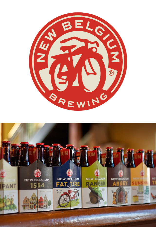
If you’ve been in business for a while, there’s a good chance certain visual cues are essential to preserve through a rebranding process. People remember you and seek you out (in part) by your “look;” this is called Brand Equity. Think about brand colors, or logo elements that people instantly recognize (like New Belgium’s iconic cruiser bicycle). These elements can be outlined through a preliminary brand audit.
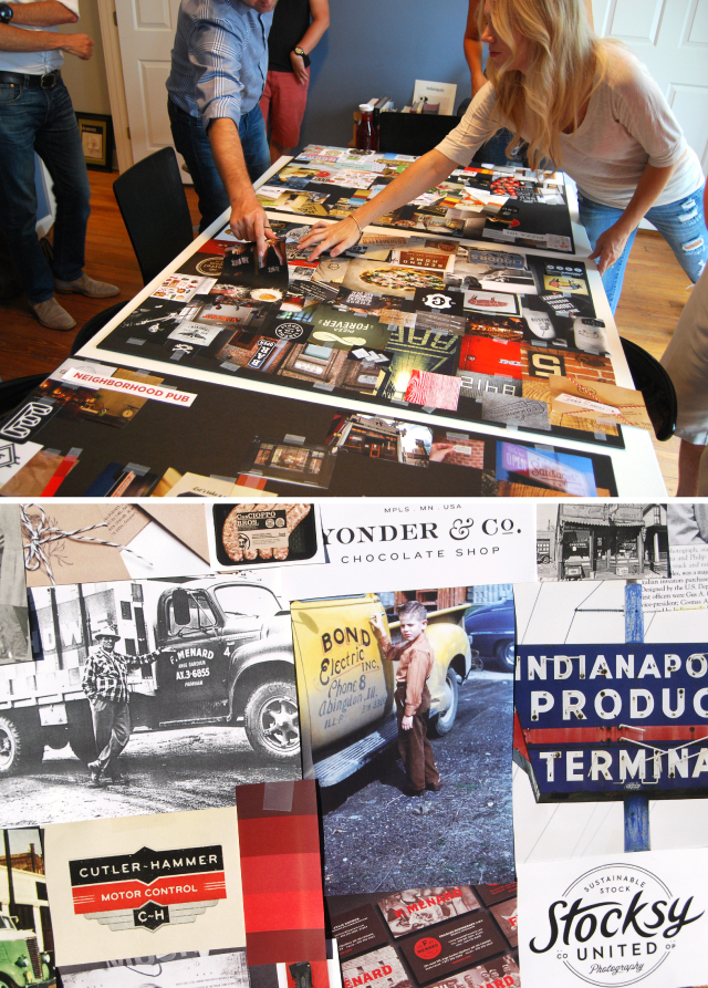
A typical audit process takes stock of every bit of communication you’ve used over the years, from your logo, to packaging, website, sales material, and ads. Using this material, you and your branding agency can suss out any constants and determine what needs to remain and what can be jettisoned.
To prepare for this, gather as much of your marketing materials as you can (posters, packaging, website screenshots, pictures of your festival setup, POP displays, merch, etc.) Even if these are the very thing driving you to rebrand, it’s important for your creative firm to see and understand what you’ve done in the past.

FIND A DESIGN FIRM
While identifying why you need to rebrand (and deciding what elements are key to your brand equity) are important considerations, finding a great design firm partner to help navigate you through this process can be the difference between a successful project and a nightmare.
You want an agency you’re comfortable with, preferably with craft beer experience. You need to find an agency who’s excited about the opportunity to work with you, and who’ll involve you throughout the entire creative process.
If you can find the right partner, they’ll handle everything we’ve discussed in this series and set you up for the next phase of your business. This process can take anywhere from 6 months to a year (potentially longer depending on the overall scope and planned rollout). But it will be well worth it when you debut your new branding.
A CLOSER LOOK
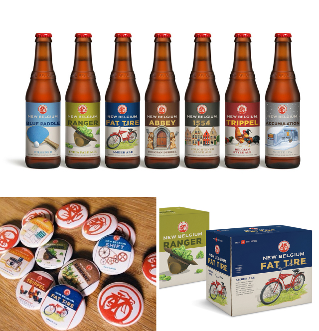
The past several years have seen several large breweries rebrand. And we’ll likely see more as more mergers and acquisitions are announced. My favorite example of an established powerhouse brewery who successfully rebranded is New Belgium.
New Belgium has some fiercely loyal fans and had to be careful not to alienate anyone through the process. Originally debuting in early 2014, Hatch Design cleaned up their brand identity, refined their packaging system (bringing consistency to bottles and cans), designed a new website, advertising, and many other smaller touchpoints. You can read a more thorough case study of the project over at Brand New.


About Brewbound Voices:
Brewbound Voices was created with the goal of providing readers valuable insight into areas like finance, investment, branding, marketing, sales, and distribution. The column serves as an avenue for experts to contribute their knowledge to our readership. Interesting in writing for Brewbound Voices? Email pitches to news@brewbound.com.
