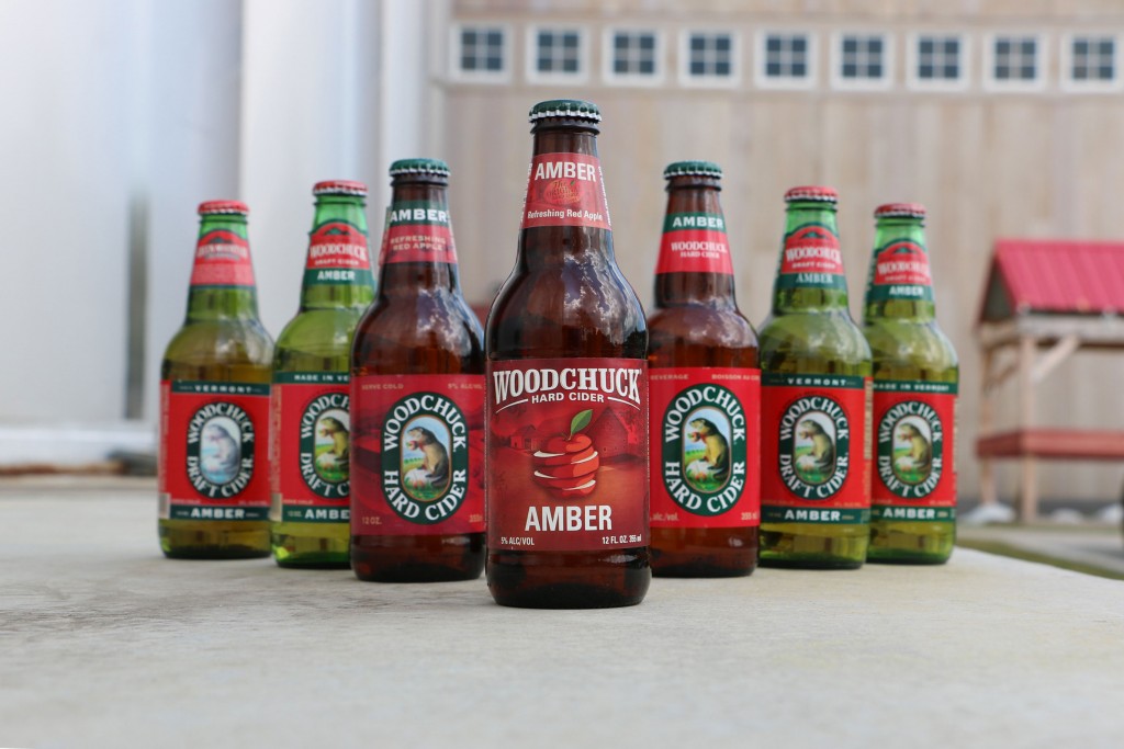
Two months after debuting its $2 million “Why Woodchuck” advertising campaign, Vermont Hard Cider has lifted the veil on a completely redesigned set of core packages.
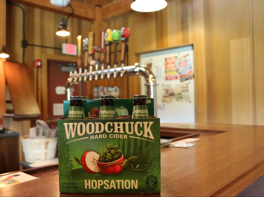
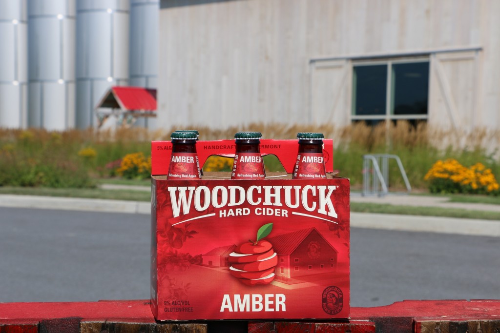
First teased in June, the new “deconstructed” six-packs, as Vermont Hard Cider’s vice president of sales Terry Hopper describes them, feature a more stylized arch to the “Woodchuck” type and focus on the primary flavors in each of the company’s core offerings: Amber, Granny Smith Pear and Hopsation.
“We’ve never changed our recipes and we’re not starting now — the taste profiles you’ve come to love over the last 24 years are all still intact,” the company wrote in a blog post. “When you spot the new Woodchuck packaging on the shelves you will see the ingredients pop out at you. From sliced apples to apples filled with hops, the imagery will highlight the taste and quality of the cider in the bottle.”
A nationwide rollout will run through October; Maine, New Hampshire and Vermont will be the first to receive the refreshed packages, Hopper said.
“These new packages are much more vibrant, colorful and are designed to help consumers understand the complexities of our different ciders,” he said.
And although Vermont Hard Cider’s wholesalers and retailers have been “really supportive” of the new look, the initial response from Woodchuck’s Facebook fan base hasn’t been as positive.
“This packaging is ugly,” wrote one user.
“This looks generic and similar to all the ‘me too’ ciders that have popped up in the past few years from huge conglomerates,” wrote another.

Hopper’s response?
“Does anybody ever like change?” he asked. “I think the old packaging meant a lot, to a lot of people, but we need to continue to progress and move forward with the category.”
Despite the early criticism from social media users, Hopper said he believes a style-forward approach with the new packages will enable Woodchuck to better differentiate each of its brands at retail.
“We had some confusion with the same picture featured throughout all of the packages,” he said.
“People get nervous when iconic brands change, but we aren’t walking away from the Woodchuck. He is still there and embodies everything that our brand is about,” he added.
Design changes to the company’s seasonal lineup will begin in February, Hopper said.


