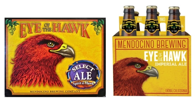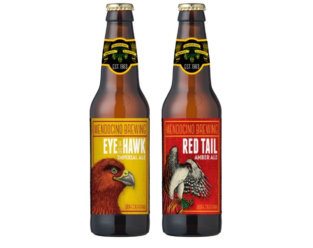
Citing stagnant growth over much of the past 17 years, Keith Tabayoyon, the Mendocino, Calif.-based brewery’s west coast general sales manager, said that in order to appeal today’s consumers, the company needed to preserve elements of what makes the brand recognizable — the red tail hawk — while also livening up the historic imagery to better catch the scanning eye of a curious drinker.
“We wanted to make sure that we didn’t lose that iconic edge that the red tail hawk represented to our original customers, so what we did was kind of strengthen the visuals of those birds,” Tabayoyon said. “Now trying to get back to the new demographics that seem to be taken over by the new craft breweries that are opening upÔǪ We’ve come up with different colors and backgrounds to incorporate what we call kind of the industrial feel in the background. With that, I think we kind of bridged the gap with new opportunities.”
Scott Mires, creative director and partner at MiresBall, the ad firm out of San Diego that masterminded Ballast Point’s new look, took some time out to weigh in on Mendocino’s updated branding as an expert in the field:
There’s a lot to like about the rebrand. More scale and pop to their package, with a freshness and simplicity to carve out their niche on the retail shelf. A bold revolution, versus evolution, will make a strong impact with their faithful followers.
That said, my gut tells me that some valuable brand equity has been lost. In the new look the craft beer pioneer pushed aside much of the naive sensibility and humble craftsman spirit that underpinned their salt of the earth visual style. In an industry that covets authenticity, I wish a bit more of that narrative visuality was maintained, or even amplified.
Check out the complete rebranding effort below.


