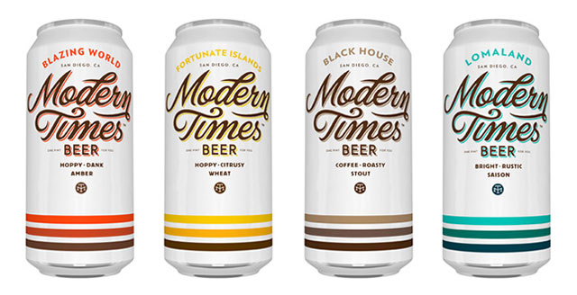
Modern Times Beer and Helms Workshop are proud to unveil the stunningly gorgeous can designs that will represent the brewery on retail shelves in 2013.
“Classic, vibrant, and oozing panache, these are the cans to drink while installing an Eames chair in your vintage Alfa Romeo lowrider. This packaging will upstage your favorite tiki mug. They are so devastatingly tasteful, a koozie would be a crime,” says Jacob McKean, founder of Modern Times.
The result of a painstaking collaborative process, the cans will house Modern Times’ four year-round beers: Fortunate Islands, a hoppy wheat beer; Black House, an oatmeal coffee stout; Blazing World, an amber IPA; and Lomaland, a food-friendly saison.
“From the moment I started working on Modern Times, I knew I wanted packaging as cockstaggeringly magnificent as the beer I planned to put in it. So I went out and hired a design ninja to craft the cans,” says McKean.
“Jacob has a unique vision for this brewery, and we do our best work with passionate clients who aren’t afraid to be different in a crowded market,” said Helms.
“We explored a host of design directions referencing forward-looking historic icons including Raymond Loewy and Norman Bel Geddes, as well as contemporary revisionists like Wes Anderson. Through that juxtaposition we arrived at a packaging system that fits perfectly into Modern Times brand story.”
To help in creating the can’s signature logotype Helms and McKean enlisted Simon Walker, a typography Jedi with a British accent.
“My hope was that this unique creative pairing could collaboratively produce something that is singularly amazing,” said McKean. “If you put a panther and a pterodactyl in a cage together, would they devour each other, or mate and produce the most terrifying monster of them all? In this case, they made beautiful cans.”
“To work on an emerging beer brand alongside the prodigiously talented Helms Workshop was a rare honor, and my only hope was that I could offer something that would do justice to the Helms aesthetic. The final result is nothing short of stunning,” said Walker.
“Jacob wanted a classic design with a timeless feel, and he felt strongly that a matte white can would help differentiate Modern Times,” said Helms Workshop designer Erick Montes. “With the three colored stripes as a bold unifying theme and a drop shadow highlighting the logos curves, the final design really does stand apart.”

